I didn't come up with a lot of concept sketches for this Christmas short. These are the only sketches I did and then I went on to production directly.
Inside this short film I also included the names of people who inspired me as a person on the post-it notes attached to the presents and also on the name list. Here are some renders with better focuses on them.
Some progress shots and the clock turn-around.
Wireframe mode
Texture & Lights. (31 Lights total)
Animating the hand
Christmas Clock Turn Around.
Have a blessed New Year, everyone !!
Monday, December 26, 2011
Christmas Card Project ( The Christmas Clock )
My Christmas Card Project is finally done !! Except it wasn't done in cut-outs, but Maya !
I've always wanted to do a Christmas short and finally got the chance to do it ! I was greatly inspired by Brian Selznick's book "The Invention Of Hugo Cabret" and I've also always been interested in toy clocks. Thought it would be great to have my own little christmas clock !
Merry Christmas !!! :)
Sunday, December 18, 2011
The Weekend before WINTER BREAK
All right ! Winter break officially starts counting from "tomorrow" since it's gonna be the first weekday of break ! And today I'll have to finish up my 12x60 inch gouache painting and start on my christmas card project ! My christmas card project is scheduled to be done on Wednesday and then I'll start archiving all of my first semester's work !
Some pictures to show what I've been working on for the 12x60 inch piece !
These were done in "A2210" aka "The Fishbowl Room", last Monday night together with some of my classmates who were also staying up late to finish their piece !
I'm off to work now, more posts to come !! :)
Some pictures to show what I've been working on for the 12x60 inch piece !
These were done in "A2210" aka "The Fishbowl Room", last Monday night together with some of my classmates who were also staying up late to finish their piece !
I'm off to work now, more posts to come !! :)
Friday, December 16, 2011
14th week (FINALS WEEK) Dec 16
It's FINALS WEEK ! But I'm actually already on my last day of class now and my last class would be institute voice where I would have to sing for my final grade!
Everybody in the character animation department has been crazy busy this past week !! Everybody was busy finishing up their color & design assignment and we even pulled an all-nighter on Monday midnight to get that 12x60 inch artwork done !
I'm actually pretty happy with the way it turned out ! I do plan to go over it again over the winter break though, which officially starts TOMORROW !!! I'll upload some pictures of it later in the day for a better explanation on that project ! I'm so excited over it !
Here's the final assignment for the semester for my Character Design class taught by Rik Maki. The goal is to design birds !
I'm really surprised by how much I've learned and improved in Rik's class in only 3 months time ! It's amazing !!!
We also had a Character Animation department party on Thursday night and they had a Mater piñata that looked really hilarious. I had the chance to hit it and since it's my first time doing this, it was pretty awkward. I didn't hit it hard enough because I was blind-folded and I couldn't see anything and people were screaming and I didn't wanna knock somebody's head off their body ! but it was really really fun !
Our class then spent the night off with our story teacher, Chong at IHop and we did caricatures of him on paper napkins. It was an awesome night out ! We headed back to CalArts shortly after that and some of us spent some time in the palace dancing the night away. A few of them went to Mulligans for karaoke after that, but I was too tired and I had to do my laundry so I passed.
Anyway, I'll be going to my institute voice class at 4, and then after that I'll be totally free !! It's gonna be WINTER BREAK for real and I have lots of things that I've planned to do such as:
-FInishing my 12x60 inch piece
-Archiving all of my assignments done in my first semester
-Christmas card (A short film done with cut-outs)
-Refining my storyboard for my first year film
-Concept art for my film
-Sketching at 3rd Street Promenade twice every week
-Finishing half of "Illusion Of Life"
-Spending a week in San Francisco ... ?
I'll be uploading another post later in the day ! Till then !!
13th week
So my brother and his girlfriend came to visit over the last 2 weekends ! I met up with them in Santa Monica and then spent the rest of my weekend with them and it was amazing!
We even got to watch Cirque Du Soleil's "IRIS" at the Kodak Theater and it's definitely a performance that every filmmaker or film student should go see! It's MIND-BLOWING! Iris is about filmmaking in general, but what was special about it was that they took aspects of filmmaking and conceptualized them through performance art and they were done amazingly. Anyway, we went to Universal Studios the next day and I even got an annual pass! I'm planning to go back there as much as I can to sketch people there. It's such an inspiring place !
My brother drove me back to CalArts on Monday night and I showed them around the campus and my dorm room and then he had to leave shortly after. It's been such an amazing 3 days and I felt like I've been spending so much time together with them here. I'm gonna miss them so much :')
Anyway, here's the sculpture that I did for my Color & Design Class. It's my first original sculpture done with sculpey and although it didn't turn out the way I wanted it to at first, I'm happy with the way it is now.
Also, we had to come up with a 12x60 inch piece of artwork for our final Color & Design assignment with "Repetition" as the theme. So I decided to do houses and trees !
Here's what my proposal looks like. It's not 12x60 inch but it's an idea that I have.
This is going do be done on Illustration boards painted with gouache and cut-outs. I've always wanted to do an original piece of artwork with gouache so it's definitely a good time to start !!
Monday, November 28, 2011
12th Week ( Nov 28 )
Here's my character design assignment for the week. We were told to design our own character and pose them according to Roger Radcliffe's poses in his model sheet from 101 Dalmatian ! So it was a really cool assignment !
I came up with designs of 2 mimes since I'm planning on making a film on mime for my first year film. The first design is a homage to the great "Marcel Marceau". :)
I'm still thinking of how to end my mime story in the best possible way now, so hopefully it'll turn out great ! :)
I came up with designs of 2 mimes since I'm planning on making a film on mime for my first year film. The first design is a homage to the great "Marcel Marceau". :)
I'm still thinking of how to end my mime story in the best possible way now, so hopefully it'll turn out great ! :)
11th Week -Thanksgiving ( Nov 24 )
So Thanksgiving break is over and Aron was nice to have me and Isaac over at his grandparent's place in Ventura to celebrate Thanksgiving with his family ! Everybody was super nice and it was my first thanksgiving so it was a vulnerable experience ! We also took a walk by the beach after dinner since the house is next to the beach. The view was amazing ! Here are some pictures I took with my mobile phone.
Awesome houses by the beach !!
The Pacific Ocean !! :)
The pier that takes forever to walk to.
This is the furthest we were able to walk to. It turned really dark so we had to turn around, but it was fun :)
Being part of the celebration was awesome and I was constantly reminded of my own family on how we would celebrate the moon cake festival together every year, but I missed it this year. Having your family around is the greatest :')
My brother's coming to LA this Thursday with his girlfriend so I'm super excited to meet him ! So, can't wait !! :)
Tuesday, November 22, 2011
11th week (Nov 21) CTN 2011 !!
Okay, so I was at CTN last Saturday and it was AMAZING !
Meeting all my favorite artists was so surreal ! Even talking to them ! It just didn't occur to me that I'll get to meet so many of them in a single day !
I even got to show my portfolio to Pascal Campion, Lorelay Bove, Bobby Chiu, Kei Acadera, Mark McDonnell, David Colman, Brittney Lee and so many other great artists !! I got lots of feedbacks and comments on ways to improve my work and it was just so inspiring being able to talk to them in person !! I also had the chance to meet new people from the industry and several other art students from art center and other colleges as well ! It was really a very rewarding experience !
The event was really awesome but expensive so I didn't go on the following day ! Waking up the next morning felt so surreal. I woke up feeling like a newborn baby but with more motivation to draw !!
Anyway, I worked on some character designs on the following day after coming back from CTN and wow, I do see a difference in my work now !
Here are some satyr designs I did for Character Design class ! Took a lot of advice I've gotten from the people whom I met at CTN and threw them all into this assignment ! The design process was a lot easier ! Had lots of fun working on them, so here they are !
THE EXAM
LINE UPS
I also did another piece of the Satyrs, but I'm going over it again after Rik Maki gave me some really good pointers on how to enhance the work ! I'm looking forward to post that up here within the end of this week, so stay tuned !! :)
10th week
Sunday, November 20, 2011
My 48 hour film ( CAPOP )
The theme for this year was Cactus ! I had lots of fun working on this, but animating on photoshop gave me a really hard time ! I like the way it turned out in the end though, and it's my first CalArts short !! HOORAY !!
Friday, November 11, 2011
8-9th Week ( Nov 11 )
Okay, so 2 posts a week didn't quite work. I was really busy last week so I didn't have the time to update this blog, but I'm glad I'm doing stuff I like, except for my critical study class this semester, but whatever. I'm gonna upload some character designs I did over the past week, and I'll upload other stuffs tomorrow.
Character Design
Here are some that I really liked from this assignment :)
Cats
60's Girls
Rik suggested that I could maybe make the strippers more athletic to bring up the stripper quality in them, and since the goal of the assignment is to also make the girls look pretty, he said I should draw them prettier too, lol.
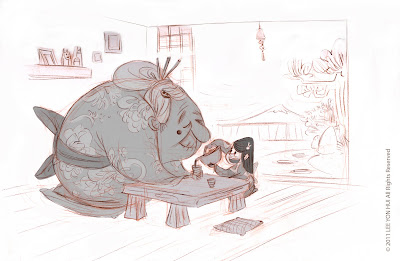
Grandma & Little Girl
Monster & Little Girl
Overall it has really been a good and fun assignment to work on. I feel like I'm getting stronger in terms of working around with simple shapes. I'm actually liking where our Character Design class is going right now. In all the designs that we have been doing, we were told to come up with a story behind the characters. Perfectly fit for what I wanna do ! I definitely agree that everything should have a story behind it. There's always a purpose behind a design you do. A well designed character with no story in it is like a peanut shell with no content in it.Or whatever. I don't eat peanuts anyway.
Oh and also, I participated in the 48 hour film event ! The theme was chosen in Keane Street last Friday night at 11:30pm and this year's theme is 'Cactus' ! I heard the theme for last year was 'Coat Hanger' so I'm not sure how it turned out last year, but Cactus sounds like fun and besides, it's a tradition for first year Character Animation Students to participate in it anyway and I wanted to experiment on my first year film's style.
I decided to do the animation in Photoshop and I wrestled with the animation feature in it ! Animating in Photoshop is not my style, but I'm glad I'm done with it ! I did a really short animation and I spent 16 hours in the whole thing. It's really simple but I liked how it turned out, and it's the first short that I've produced in CalArts.
The screening for the 48 hour film is gonna take place in the Bijou theater tomorrow at 10pm ! I can't wait to see all the amazing shorts already ! I've been seeing people working on really cool stuff !
Oh and it's PIXAR day tomorrow !! But I won't be talking about it that much now, I'm just gonna expect a lot from tomorrow !
So yeah, this is it for today !!
Thursday, October 27, 2011
7th Week - ( Oct 24-26 )
I'm thinking of updating this blog every 2 or 3 days so I don't have to pile up all of my artworks and write a long entry by the end of the week. So here comes the first few updates !
Character Design
The assignment was to come up with either designs of bears,apes or gorillas. I was meaning to design bears, but It didn't work out that well for me, so I designed the gorillas instead.
Here are the few that I did, I really liked how they turned out ! It was a fun process overall ! :)
This is definitely my favorite piece of all ! I wanted to take it into another direction, something more personal. :)
I remember talking to Steve Brown on my first day of Orientation week at CalArts, and he gave me a very useful piece of advice. He told me, " Whenever you're stuck and you can't draw, think of a story and your drawings will come naturally ".
Many times I've wasted my hours away trying to figure out ways to create beautiful and appealing designs that I get caught up in fancy design elements which has no relation to any story telling at all. Rik Maki said, " No matter what you design, it has to have a story. A beautiful character standing in space doing nothing ain't gonna work".
Research is another vital element you don't wanna lack in whatever you do. Abraham Lincoln once said, " If I have 8 hours to chop down a tree, I'd spend 6 hours sharpening the axe". That makes me think twice before I start putting my pen down on my paper trying to ace for the perfect drawing or design. Spending 6 hours researching on your character is better than wasting 24 hours searching for the right design without prior research or knowledge of your subject.
I find more solidity in my artwork often when I have both research and story contextualized in my work !
Digital Methods
Another Monday class ! I'm learning so much about TV Paint now and there's so much it can do with it ! Fran has been showing us so many cool stuff we can do with it ! TV Paint rocks.
We learned to play around with the camera the other day. It's pretty cool cuz it has a multi-plane camera option. Here's a test I did with a single-plane camera option during Fran's class.
I'm experimenting on my first year film's style right now, and I want to be able to catch up with TV Paint before the end of this term so I don't get bogged down by technical issues when working on my short film !
2D Animation
Ok, so 2D Animation has been really fun ! The assignments have been pretty forgiving so far and I can't wait to start animating the real deal, but at the same time, I'm really honing my animation skills to prepare myself for my first year film.
So here's the head turn assignment which I turned in for class today.
I had fun working on this assignment and it was really challenging. Most of the challenges came from the graphical design that I have in my character. Matt Williames, who's our instructor mentioned how some cartoon characters weren't meant to be seen from certain angles due to the design. Daffy duck, for instance.
I've been learning a lot in Matt's class from the videos he's been showing us. Matt has been stressing on how important acting is in animation, or in any film at all, and that we should really watch and study more films. I have to get started on watching more films! I really don't know enough films out there! I downloaded an iPad program called "Film Study" which comes with a list of films in it of different genres ranging from the 1910's to contemporary films. The coolest thing about this software is that it allows me to pause at a certain frame of the movie, and analyze it with some cool features available in that software.
So, more research, more film study, more hard work !
I'll be updating pretty soon again before the end of this week !
See ya !!
Character Design
The assignment was to come up with either designs of bears,apes or gorillas. I was meaning to design bears, but It didn't work out that well for me, so I designed the gorillas instead.
Here are the few that I did, I really liked how they turned out ! It was a fun process overall ! :)
This is definitely my favorite piece of all ! I wanted to take it into another direction, something more personal. :)
I remember talking to Steve Brown on my first day of Orientation week at CalArts, and he gave me a very useful piece of advice. He told me, " Whenever you're stuck and you can't draw, think of a story and your drawings will come naturally ".
Many times I've wasted my hours away trying to figure out ways to create beautiful and appealing designs that I get caught up in fancy design elements which has no relation to any story telling at all. Rik Maki said, " No matter what you design, it has to have a story. A beautiful character standing in space doing nothing ain't gonna work".
Research is another vital element you don't wanna lack in whatever you do. Abraham Lincoln once said, " If I have 8 hours to chop down a tree, I'd spend 6 hours sharpening the axe". That makes me think twice before I start putting my pen down on my paper trying to ace for the perfect drawing or design. Spending 6 hours researching on your character is better than wasting 24 hours searching for the right design without prior research or knowledge of your subject.
I find more solidity in my artwork often when I have both research and story contextualized in my work !
Digital Methods
Another Monday class ! I'm learning so much about TV Paint now and there's so much it can do with it ! Fran has been showing us so many cool stuff we can do with it ! TV Paint rocks.
We learned to play around with the camera the other day. It's pretty cool cuz it has a multi-plane camera option. Here's a test I did with a single-plane camera option during Fran's class.
I'm experimenting on my first year film's style right now, and I want to be able to catch up with TV Paint before the end of this term so I don't get bogged down by technical issues when working on my short film !
2D Animation
Ok, so 2D Animation has been really fun ! The assignments have been pretty forgiving so far and I can't wait to start animating the real deal, but at the same time, I'm really honing my animation skills to prepare myself for my first year film.
So here's the head turn assignment which I turned in for class today.
I had fun working on this assignment and it was really challenging. Most of the challenges came from the graphical design that I have in my character. Matt Williames, who's our instructor mentioned how some cartoon characters weren't meant to be seen from certain angles due to the design. Daffy duck, for instance.
I've been learning a lot in Matt's class from the videos he's been showing us. Matt has been stressing on how important acting is in animation, or in any film at all, and that we should really watch and study more films. I have to get started on watching more films! I really don't know enough films out there! I downloaded an iPad program called "Film Study" which comes with a list of films in it of different genres ranging from the 1910's to contemporary films. The coolest thing about this software is that it allows me to pause at a certain frame of the movie, and analyze it with some cool features available in that software.
So, more research, more film study, more hard work !
I'll be updating pretty soon again before the end of this week !
See ya !!
Sunday, October 23, 2011
6th Week - ( Oct 13 - 23 )
So, life has been really good ! I've done 2 storyboards for my story class so far and I'm really glad that we're finally getting started on this !
Story
The first storyboard assignment was to come up with a 40 panel max storyboard with no camera cuts or movements. It was really challenging because a lot of thoughts and considerations went into the composition of the settings and the overall size and designs of the character and props in order to avoid cropping the character out or limiting the action of the character. And to make it even harder, we can only have one character in it. The hardest part of this assignment for me was the attempt of keeping the size of the character consistent in every panel !
It was the first storyboard and pitch I did at CalArts, so it was really one of the most important moment and day of my life ! And I even got my own retractable pointer from Chong !
I did a capture of every panel for my first storyboard with my iPad using iMotionHD, but the panels are jumping all around so forgive me for not doing a better job at that !! But anyway, here it is ! :)
The next assignment was to come up with a 30 seconds storyboard and again with no camera cuts. The jumping point given was the idea of a mailman trying to deliver a mail but a dog gets in his way. Again I had LOADS of fun with this ! I'll upload the board up here pretty soon, I promise !
Character Design
So for Character design, we were told to design a horse based on Chen Yi's style. If you haven't figured out who Chen Yi is, he's the awesome guy who designed 'Khan' in Mulan. It's a shame I haven't heard of him not till Rik Maki showed us some model sheets he did of Khan. Here's a interview of him by Character Design, check it out cuz it's pretty cool. http://chen-yi-chan-interview.blogspot.com/
So here are the horses that I did !
Rik Maki actually favored this one, which turned out to be my least favorite of all. I even thought of setting this aside not showing this to Rik cuz I thought it was bad. What I've learned so far here is that, sometimes you're just not the best judge of your work and the best thing to do is really showing your work to people around you and get feedbacks. Your crappiest work might turn out to be the winning work that'll get you somewhere, you never know. ( He brought up a good point on how making the man smaller would strengthen the whole piece though )
My classmate, Paula, pointed out that it'd be good to have a ground plane in a drawing like this to tell the relation from character to ground which makes a more solid composition than to have them floating in the air.
This is my favorite of all !
Color & Design
Okay so I have to admit that Color & Design is a real tedious class, but I enjoyed most of my working process. To goal is to come up with a CD cover design based off your thumb print.
So I came up with a whole set of Matryoshka dolls ! It's a Russian Folk Instrumental CD !
The idea behind this concept is based on the Russian Folk Tale, Baba Yaga.
This was done with Gouache on Illustration Boards. I'm starting to love Gouach !
The next assignment was the silhouette project and basically what we were told is to come up with a proposal of a silhouette design that we plan to install on the wall of any part of the school. I picked the main gallery so I had to get a permission from the art school. I filed a request form and on the next day I got a call from the art school informing me on my permission to install my work up on the wall in the main gallery ! It was great news, but then we got a little meeting with Leo, out instructor, and we were told that the deadline will be pushed one week ahead due to the halloween party that'll take place in that same week, and that we were given the choice to either work with the walls, or on a smaller scale project. I chose to stick to the wall but my permission to install my silhouette design in the main gallery was then denied because they had a plan on setting up an exhibition from the art school on the same week the deadline of my silhouette design was pushed to. I was disappointed cuz I was really excited and I was looking forward to this project and I liked my idea. But the good side is that I don't have to work on such a huge scale project anymore, which could save me more time so that I can focus on my other assignments !! So anyway, here's the proposal I did for the Silhouette Project !
Time to hunt for another wall ! Or not !
Subscribe to:
Posts (Atom)